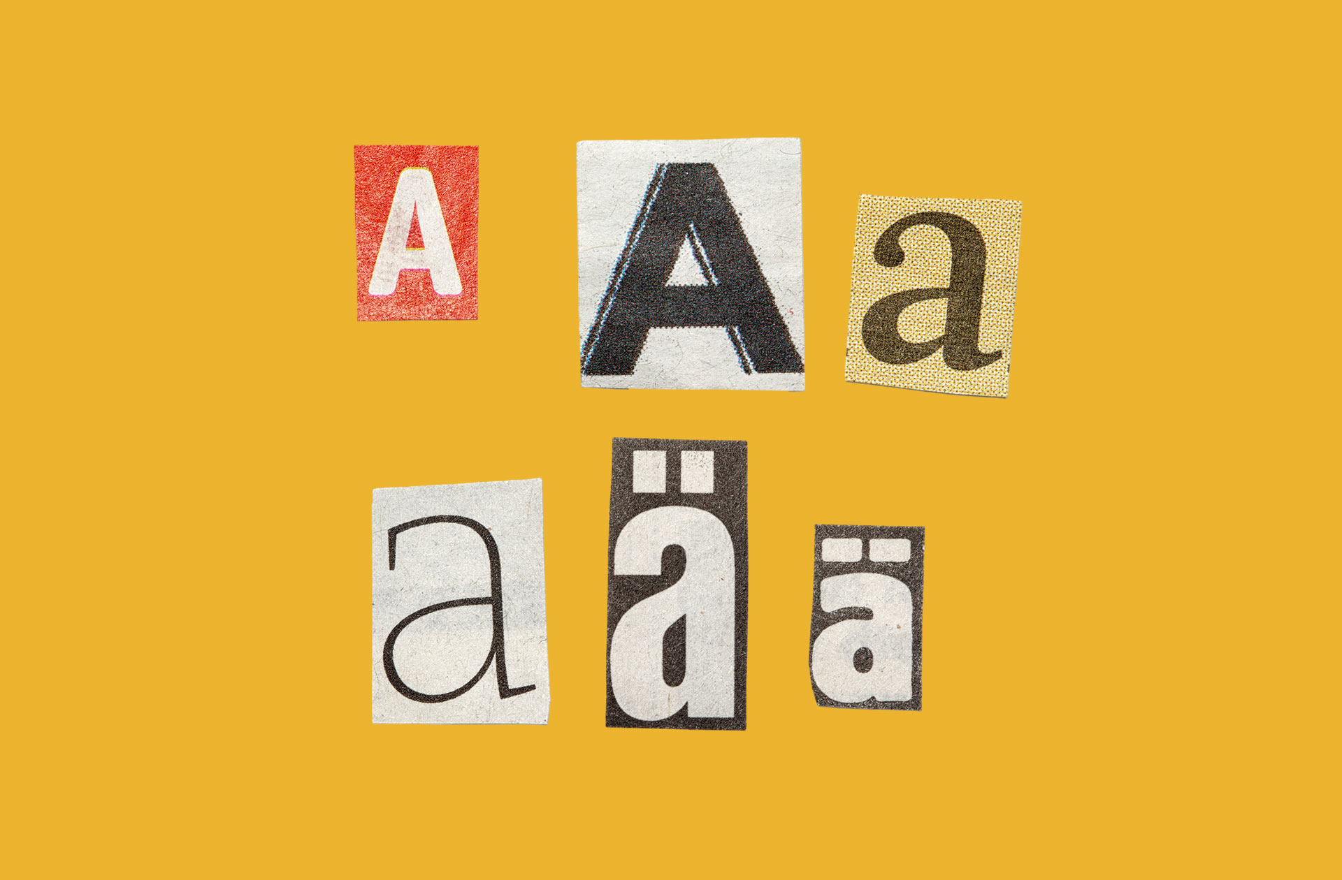
While fonts may seem insignificant, their impact on design, marketing, and branding is profound. From a practical point of view, typography’s main role is to ensure legibility and enhance readability.
But fonts also have a psychological and emotional impact, and that will be the focus of this piece:
Understanding the emotional spectrum of fonts
Fonts can evoke moods and emotions in their viewers. Each font has its own connotations, and understanding these can help you to choose the right font for your project. We won’t go through every single font type. But the following general rules give an insight into the emotional spectrum of fonts.
Serif fonts
These fonts, with their small lines or strokes at the ends of letters, are often associated with tradition, authority, and formality. They are ideal for brands that want to convey trust and reliability.
Sans-serif fonts
Clean and straightforward, sans-serif fonts are often seen as modern, friendly, and approachable. They work well for brands that want to appear cutting-edge or minimalist.
Script fonts
Flowing and elegant, script fonts can evoke feelings of creativity, luxury, and sophistication. These are often used by brands in the fashion, beauty, and creative industries.
Display fonts
These fonts are often bold and eye-catching, designed to make a statement. They are perfect for brands that want to appear strong, unique, or edgy.
How can typography convey brand personality?
It is no coincidence that brands within the same industry tend to choose similar fonts. That’s because they are trying to appeal to the same consumer base and convey similar types of brand personality. An example is banks and financial institutions tending to use serif fonts because these traditional fonts convey a sense of authority.
Rounded and bubbly fonts work best for children’s brands because they have an approachable and friendly personality. Luxury brands often opt for script fonts because of the elegance that they exude. And a tech company might opt for a sans-serif font to reflect innovation and forward-thinking.
Thinking about font sizing and spacing
The sizing and spacing that you use with your fonts can serve a vital role for your readers, and therefore help to keep them on your page and interacting with your brand for longer. Font sizes can act as a visual hierarchy,
guiding the reader’s eye to the most important information first.
Choosing the right sizing and spacing can also make your pieces more readable, helping to break up large blocks of text. Finally spacing also serves the important role of creating a balanced and harmonious layout that’s visually pleasing.
Why is it important for brands to maintain typography consistency?
Type consistency helps to build brand recognition. Before they even read what you have to say, your consumers will know the message is from you by your typography style. To ensure that your brand is consistent, you should consider developing comprehensive brand guidelines that include specific instructions for typography usage, including fonts, sizes, spacing, and when to use different styles.
Maintaining cross-platform consistency is essential; your chosen fonts should be used uniformly across both digital and print platforms to create a cohesive brand image.
Ready to elevate your brand with expert design?
Typography is a vital element in crafting a cohesive brand identity, it’s both an art and a science. Effective typography requires a deep understanding of design principles, brand psychology, and a keen eye for choosing fonts that resonate with your brand’s voice. When done well, typography reinforces brand personality and helps create lasting connections with your audience.
We take a holistic approach to brand design, where every element, including typography, is thoughtfully crafted to amplify your brand’s impact. If you’re looking to build a strong, memorable brand, let’s connect and talk about how we can bring your vision to life!


