Disturbance Media
- Website Design
- Brand & Identity
- Year: 2023
- Project: Disturbance Media Website
Disturbance Media specialise in helping businesses with their content marketing. This is done in the form of some seriously cool videography and photography.
When discussing the project it was agreed that the website should have an edgy and urban feel to stay consistent with the brand identity.
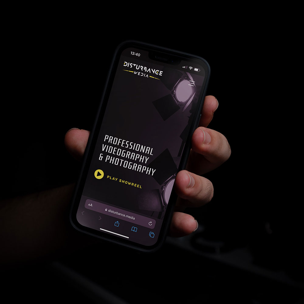
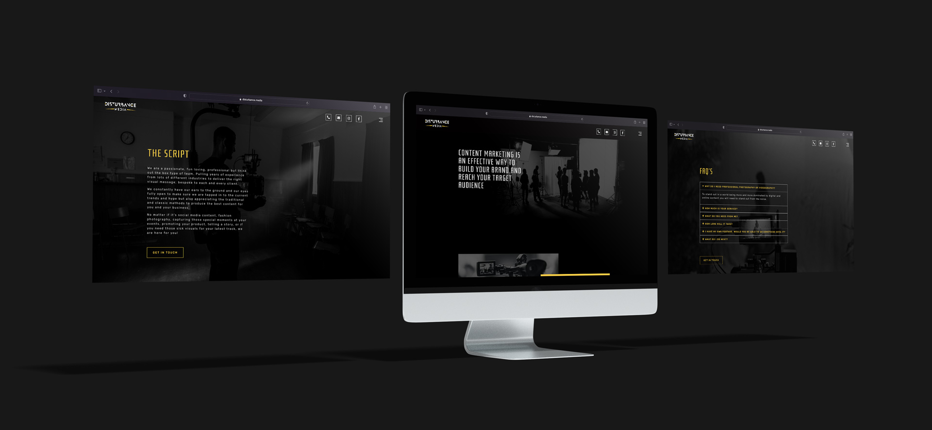
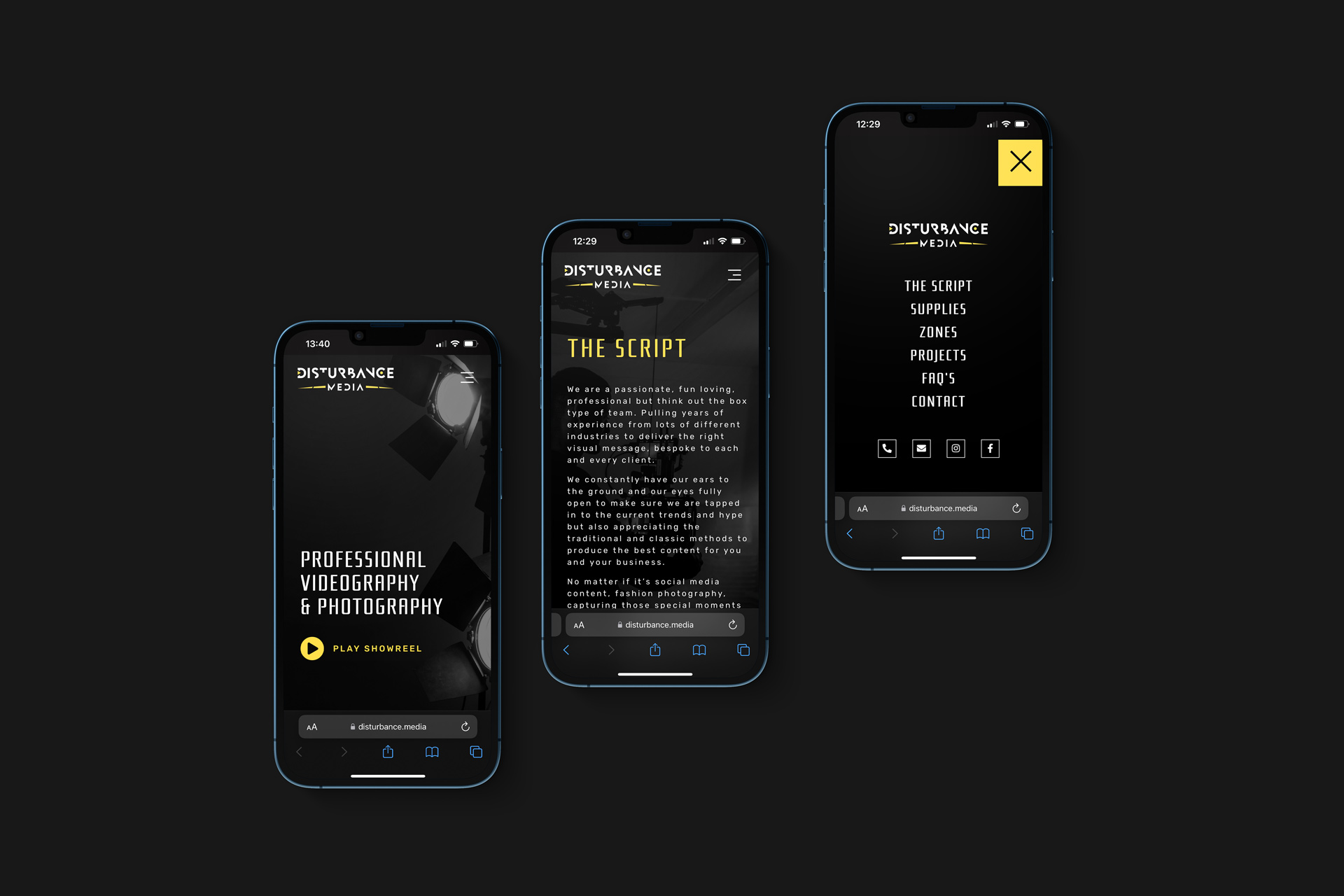
Designed from the ground up, the design effectively portrays the feeling of the brand and shows off their portfolio in an attractive way. The dark aesthetic and imagery contrast perfectly with the bold brand colours.


"I gave SquareMorph quite a vague brief and they more than delivered and in a really quick time period. My website looked incredible and I'm really happy with it. Will certainly be back in touch with SquareMorph with future projects."
- Jay Marvel - Disturbance Media